
Oh yeah, the LP cover is way different -- almost identical in coloring and typeface. I forgot about the CD cover....
Actually, now that I think of it a bunch of the Lovely LPs have that design.
Yeah, Graham is as big a Robert Ashley fan as anyone I know...
Graham Lambkin
The Private Parts vinyl I have was released around the time of the New Music America festival in Minneapolis, 1980. Ashley distributed two albums at the festival; one was Private Parts.
I am holding it in my hands, it is identical to The Breadwinner.
I cannot find a Google image of the cover. It is the same shade of mustard background, a chocolate brown Robert Ashley atop the cover. The title, Private Parts, , is cropped off. The subtitle area says "with settings for piano and orchestra by "Blue" Gene Tyranny.
The release is LML 1001, 1977.
Homage!
I am holding it in my hands, it is identical to The Breadwinner.
I cannot find a Google image of the cover. It is the same shade of mustard background, a chocolate brown Robert Ashley atop the cover. The title, Private Parts, , is cropped off. The subtitle area says "with settings for piano and orchestra by "Blue" Gene Tyranny.
The release is LML 1001, 1977.
Homage!
http://crowwithnomouth.wordpress.com/
Experimental music should be something that suggests a way of organizing your thinking, your attitude toward the world, which suggests that the world could be different.
Christian Wolff 2014
Experimental music should be something that suggests a way of organizing your thinking, your attitude toward the world, which suggests that the world could be different.
Christian Wolff 2014

-
user_5287

http://www.discogs.com/image/R-436672-1113241857.jpg" onclick= "window.open(this.href);return false;
or
http://www.discogs.com/viewimages?what=R&obid=436672" onclick= "window.open(this.href);return false;
(doesn't seem to like hotlinking)
or
http://www.discogs.com/viewimages?what=R&obid=436672" onclick= "window.open(this.href);return false;
(doesn't seem to like hotlinking)
You, of all people, should understand
that wouldn't open for me at all, but the page is here: http://www.discogs.com/viewimages?what=R&obid=436672" onclick= "window.open(this.href);return false;
the position switch between artist and title is amusing me at the moment.
m
the position switch between artist and title is amusing me at the moment.
m
-
user_5287
To be even geekier about this (and to be somewhat of a braggart), I just remembered that I have a test pressing of Private Parts. Which is cool, but not quite as cool as my test pressing of I'm Some Songs.
For my money, I'm Some Songs is the best Shadow Ring LP. The trilogy of Lighthouse, Lindus, and that bastard is truly formidable.
Just got an email from Jason about setting up a Breadwinner show here in Western Mass, so I guess I'll post details as they emerge.
For my money, I'm Some Songs is the best Shadow Ring LP. The trilogy of Lighthouse, Lindus, and that bastard is truly formidable.
Just got an email from Jason about setting up a Breadwinner show here in Western Mass, so I guess I'll post details as they emerge.
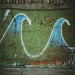
Right down to the cover art, which looks like a discarded Polaroid from a house party, the person (Graham I assume) isnt looking at the camera, and isnt in the center of the photo. some empty heineken bottles. blurry.kreftingmoondawn wrote:
2)About the comment that Salmon Run sounding like a box of tapes found in a new apartment: Graham told me years ago when Lindus came out that his goal was to make something that sounded like a tape you'd find abandoned in a gutter somewhere. I think the "strange window into someone else's private life" is a big part of Lambkin's aesthetic. When we've recorded together it has mostly consisted of us just bumbling around the house, creaking boards, running water, etc. Some of that stuff actually made it on to Salmon Run. I remember the first time I heard it thinking "Oh my god! That' the squeak of my suitcase handle!" A strange moment to say the least.
The whole conception music + coverart struck me as echoing those websites and people who collect found photos and cassettes other things they find in parks and garbage cans.
Still like SR a lot, though I've taken a break from it for now.
-
user_2274
Yes, that's a keen observation. I like this aspect, also.mudd wrote: the position switch between artist and title is amusing me at the moment.
I was just reading the bernhard g?nter interview posted by Dan Warburton and bernard cited the use of lowercase letters for the artists on trente oiseaux while the titles of the music are always in caps.
Perhaps Graham and Jason are making a similar statement about the music in relation to the artists?
-
user_5287


Excellent! Missed Jason when he (and many others) played at the Bookmill a little more than a year ago. This would be amazing. Hope it's on a weekend (please?)kreftingmoondawn wrote:Just got an email from Jason about setting up a Breadwinner show here in Western Mass, so I guess I'll post details as they emerge.

Jon,
If the idea of the CD cover is to be as close to the Ashley LP as possible, you might should hire a designer to realize the concept, or at least re-do it, 'cause what you have now is off kilter just enough in about half a dozen ways that it's merely reminiscent of the orignal, rather than being a dead-on hommage.
All of the fonts used for the Breadwinner are slightly different from those on Private Parts. Ashley's name is in boldface, the Breadwinner is in regular weight type. Private Lives in in a sans serif face; Lambkin & Lescalleet's names are not. The subtitle on Private Lives is lighter than standard weight, while the weight of the subtitle on the Breadwinner is about the same as the title face (though cause it's smaller it may seem to be lighter). Compared to the boldfaced Robert Ashley, the vertical "the" in front of Breadwinner throws off the balance of the line of type. The vertical brown stripe, which I assume would be printed on the tray card and showing through a clear jewel box, is just weird compared to the original.
If the idea of the CD cover is to be as close to the Ashley LP as possible, you might should hire a designer to realize the concept, or at least re-do it, 'cause what you have now is off kilter just enough in about half a dozen ways that it's merely reminiscent of the orignal, rather than being a dead-on hommage.
All of the fonts used for the Breadwinner are slightly different from those on Private Parts. Ashley's name is in boldface, the Breadwinner is in regular weight type. Private Lives in in a sans serif face; Lambkin & Lescalleet's names are not. The subtitle on Private Lives is lighter than standard weight, while the weight of the subtitle on the Breadwinner is about the same as the title face (though cause it's smaller it may seem to be lighter). Compared to the boldfaced Robert Ashley, the vertical "the" in front of Breadwinner throws off the balance of the line of type. The vertical brown stripe, which I assume would be printed on the tray card and showing through a clear jewel box, is just weird compared to the original.
-
user_2274
Jon, is this cover supposed to be a dead-on homage?Herb Levy wrote: what you have now is off kilter just enough in about half a dozen ways that it's merely reminiscent of the orignal, rather than being a dead-on hommage.
I don't know much about Lambkin's aesthetic, but given Lescalleet's history of intertextual wordplay and sense of humor coupled with his exacting eye for details, I doubt the cover is supposed to be an exact duplicate.
Herb has a point here, Jon. You should probably release this as an LP to avoid the brown stripe, and to maintain an authentic "hommage".Herb Levy wrote: The vertical brown stripe, which I assume would be printed on the tray card and showing through a clear jewel box, is just weird compared to the original.
-
fearandpanic

- Posts: 2363
- Joined: Wed May 14, 2008 12:41 pm
I wish as much effort could be put into considering (any of) Lambkin's music in this thread. The minutae of a cover of a CD that hasn't even been released yet can't really be anybody's idea of a gripping discussion--if it is, I suggest some other place to do it. The Breadwinner stuff--and my sanity--would benefit by it having its own thread in the I Hate Promotions forum until the music can be discussed here. That way, the rest of us can be spared countless posts of minute-to-minute details from the printers, when it'll be in stock, who is paypaling who, and all of that crap. As it is, the discussion of Lambkin's music, believe or not something I and others are actually interested in reading, is getting swamped in his own thread.Herb Levy wrote: All of the fonts used for the Breadwinner are slightly different from those on Private Parts. Ashley's name is in boldface, the Breadwinner is in regular weight type. Private Lives in in a sans serif face; Lambkin & Lescalleet's names are not. The subtitle on Private Lives is lighter than standard weight, while the weight of the subtitle on the Breadwinner is about the same as the title face (though cause it's smaller it may seem to be lighter). Compared to the boldfaced Robert Ashley, the vertical "the" in front of Breadwinner throws off the balance of the line of type. The vertical brown stripe, which I assume would be printed on the tray card and showing through a clear jewel box, is just weird compared to the original.