

(Loosely speaking), according to E. Tufte, a well written graphical representation should:Yii wrote:

1 - Above all else show the data.
2 - Maximize the data-ink ratio.
The score above is a non-entity as it fails on both: (a) There is little information about the music and (b) there is excessive duplication of the words "rest" and "perform" - i.e. a lot of ink.
Maybe this is a better one:
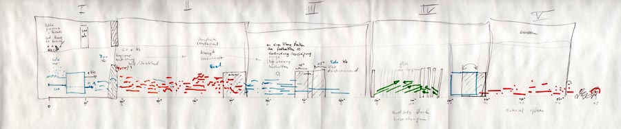
Mendota Stoppages from Polwechsel 3
It gets better if you look at it for 15 minutes and follow the track.
To me this looks like an intriguing secret script. I'm not a musician, so I would be interested to read comments (or other examples) on how suggestive this score is.
(there is a better version of this score here: http://www.polwechsel.com/pdf/score_mendota_001.pdf)


